
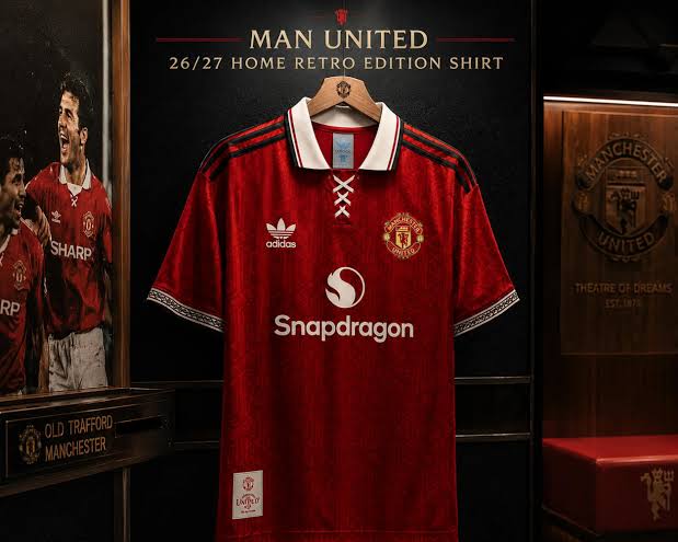
A red shirt with white shorts and black socks is one of the most recognisable kits in world football, and it has barely changed in shape for a century. What has changed, repeatedly, is everything around it: the collar, the cut, the badge, the sponsor across the chest and the maker’s logo on the sleeve. Those details are the reason collecting United shirts is interesting at all. Each one is a small time stamp, and once you learn to read them you can usually date a shirt within two or three seasons just by looking at the neck.
That is also why manchester united retro shirts are one of the busiest corners of the reproduction market. Demand is huge, the designs are famous, and the differences between a good reproduction and a poor one sit in exactly those small details. This guide walks through the eras most collectors care about, explains what makes each one distinctive, and then sets out the checks worth running before you spend anything.
Why United’s older shirts hold their appeal
Most clubs have two or three kits that fans remember. United have a long run of them, partly because the club was winning trophies through several different design periods, and partly because the shirts kept pace with the fashions of the day. A shirt from 1977 looks nothing like one from 1994, which looks nothing like one from 2008, and yet all three are instantly identifiable as United.
There is also a practical reason. United’s away and third kits have been unusually adventurous — blue, white, black, grey, gold — so the back catalogue gives you options beyond plain red. If you already own a home shirt and want something different, the alternative kits are where the character sits. Collectors tend to start with the obvious red and then work outwards.
The Admiral years: the late seventies look
Admiral supplied United through the second half of the seventies, and the shirts from that period are the ones people picture when they think of vintage English football. The cut is loose by modern standards, the collar is wide, and the trim runs in bold bands down the sleeve and around the neck. The fabric is heavier too — these were shirts made before anyone worried much about breathability.
This was also the era before shirt sponsorship arrived in English football, so the chest is clean apart from the badge. That simplicity is a large part of the appeal, and it is one of the easiest ways to spot a reproduction that has taken liberties. If a seventies shirt arrives with a sponsor printed across it, something is wrong. Nothing belongs on the front but the crest.
The adidas decade: 1980 to 1992
Adidas took over at the start of the eighties and stayed for twelve seasons, which covers a lot of ground. Early in that run the shirts are still fairly plain, with the three stripes on the shoulder and a modest collar. By the end of the eighties the designs had become far busier, with shadow patterns woven into the fabric and geometric trims that look very much of their time.
The other change in this period is the sponsor. Sharp’s name appeared on the front from the early eighties and stayed there for close to twenty years, which means a Sharp logo on its own does not narrow a shirt down much. You need the collar shape, the badge style and the maker’s mark to pin down the season. The 1990 to 1992 away shirt, in blue and white with a dense patterned front, is one of the most reproduced designs from the whole decade, and it is a good example of how much the eighties aesthetic had shifted by the time adidas handed over.
The Umbro era and the nineties boom
Umbro supplied United for ten seasons from 1992, and this is the period that produced most of the shirts people chase. It covers the first Premier League title, the double-winning sides and the treble of 1999. It also covers the grey away shirt that United abandoned at half time at Southampton in 1996, with Alex Ferguson arguing that his players could not pick each other out against the crowd. Whatever you make of the explanation, it made that shirt famous, and reproductions of it still sell.
The nineties were also when kit design went fully commercial. Third shirts became routine, patterns got louder, and the club began releasing new designs on a predictable cycle. For collectors that is useful, because it means there is a wide range of genuinely different shirts from a single decade. If you want one shirt that sums the period up, the 1999 home shirt is the obvious choice, though it is also the one most often copied badly.
Which Manchester United retro shirt should you start with?
If you are buying your first one, start with a season that means something to you rather than the season that is most collectable. A shirt you have a memory attached to will get worn; a shirt you bought because a forum said it was significant will sit in a drawer.
Beyond that, there are two sensible routes. The first is to pick a decade and stay in it, which gives you a small set that looks coherent hung together. The second is to pick one shirt from each supplier era — one Admiral, one adidas, one Umbro, one from the Nike years that followed — which gives you a visual history of the club in four pieces. Both approaches work better than buying whatever happens to be discounted.
How can you tell a good reproduction from a poor one?
The badge is the first place to look. On a well-made reproduction the crest is embroidered with clean edges and the devil’s trident, the ship and the footballs are all distinct. On a poor one the stitching is dense and muddy, and the fine details inside the crest blur together. Hold it up at arm’s length: if you cannot make out the separate elements, the rest of the shirt is unlikely to be any better.
Next, look at the collar and cuffs. Period shirts had specific neck constructions — wide pointed collars in the seventies, buttoned or ribbed necks in the eighties and nineties — and these are expensive to get right, so they are the first thing a cheap reproduction simplifies. A nineties design wearing a modern crew neck has been made to a price.
Then check the lettering. Each era had its own number font, and the shapes of the digits are distinctive enough that a wrong font is obvious once you have seen the right one. Finally, feel the fabric. Older shirts were made from heavier material with a visible weave, and a reproduction printed on thin modern polyester will look flat and feel slippery in the hand.
What to check before you buy
Ask the seller which season the shirt is meant to represent, and check that the sponsor, maker and badge all belong to that season. Mismatches are common. Look for photographs of the actual item rather than a stock image, and make sure one of them shows the inside of the neck, where the sizing and wash labels sit.
Sizing is the other thing worth sorting out in advance. Retro cuts are generally boxier through the body and shorter in the sleeve than modern shirts, so your usual size may not behave as you expect. Measure a shirt you already own flat across the chest and compare that number to the seller’s measurements rather than trusting the letter on the label. If you want to go deeper on how the club’s modern range is put together, our guide to Manchester United’s home, away and third kits covers the current pattern.
Finally, take a moment over the return policy. Retro reproductions vary more than new kit does, and being able to send something back is worth more than saving a few pounds. The National Football Museum is a good place to look at period shirts up close if you want to train your eye before committing.
Frequently asked questions
Are retro football shirts made to the original sizes?
Usually not exactly. Most reproductions use the original shape — boxier body, shorter sleeve — but are graded to modern size labels. Always compare measurements rather than relying on the size letter.
Why do some retro shirts have no sponsor on the front?
English clubs did not carry shirt sponsors until the end of the seventies, so genuine designs from before that point have a clean chest. A sponsor on a mid-seventies design is a sign the shirt is not accurate.
Is a heavier fabric a good sign on a retro shirt?
Generally yes. Older shirts were made from thicker material with a visible weave, so a reproduction that feels substantial is more likely to have been made with the period in mind. Very thin, shiny polyester suggests a modern blank with an old design printed on it.
Which United era is hardest to reproduce well?
The seventies, because the wide collar and heavy fabric are both expensive to replicate. Those are also the first details a cheap version cuts, which makes them a useful test. Players chasing form is a different kind of puzzle, and we look at that in why strikers go through goal droughts.
Leave a Reply